Let’s face it, most websites are almost completely useless.
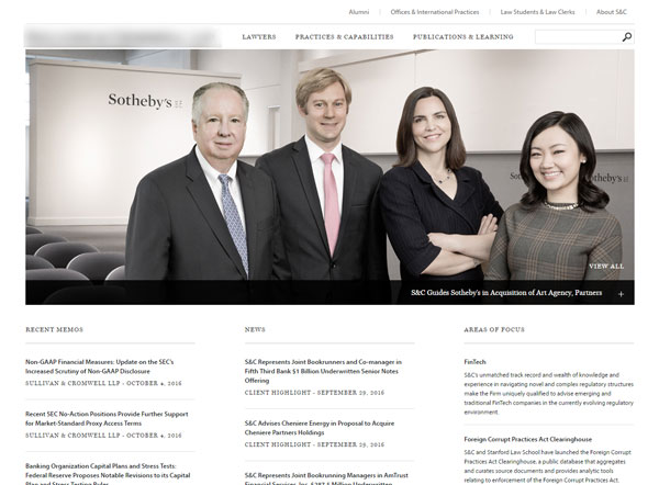
What’s worse is that we’re all capable of doing so much better with just a little more effort. Does your company’s website look something like this?
Today, we’re going to take a look at the real financial differences between one of these “useless sites”, and one that’s compelling.
Before we get going, I want to quickly define what I mean by that:
A Compelling Website
(n.) A website that is so simple and human-centric that visitors simply cannot help but engage with it.
Alright, let’s do this.
Understanding the big picture.
To be frank, the fact that most websites are terrible at doing what they’re designed to do makes it that much better when you have one that does so with ease.
Let me paint a picture for you.
A potential customer (or client) is browsing the web, and stumbles across your newly-designed site. Given that the bar is so low (because everyone else’s sites are horrific), they do this:

Your customers are going to give a huge sigh of relief knowing that they’ve finally landed on a site that was designed with them in mind.
So what happens next? Well, in a nutshell, people will…
- Call you more often.
- Buy your products more often.
- Recommend you to their friends.
- Share your content with other humans.
- Sign up for your webinars, etc.
But what’s actually going on that leads to all of this? Well friend, I’m glad you asked because that’s where we’re going next!
Your website is your face.
What causes any sort of business transaction nowadays? (Hint: it’s the same thing that’s been powering business transactions for thousands of years).
Is it the fancy features of your product? Unlikely.
Is it your business cards? Well, it is if you’re Rose Garden Consulting.
Is it your pricing? Depends.
Is it that sexy logo of yours? Sometimes.
Here’s the reality. People buy from you once they’ve established five things:
- They need to be experiencing a very painful problem — you can’t sell your solution to everyone.
- They need to know you exist — awareness campaigns or direct marketing work wonders here.
- They need to be able to afford you — so make sure you’re qualifying the traffic from Step 2.
- They need to know beyond a shadow of a doubt that you will solve their problems — they need to trust you.
- They need to like your company — this is a weird one, but it’s so shockingly overlooked.
I’m going to cover Steps 1-3 in other articles, today we’re focusing on 4 & 5.
Here’s what I’m getting at: if your customers don’t like or trust your company, you’re not going to sell them anything — having a confusing, wordy website is an easy way to destroy any trust you’ve built up.
Your website is actively harming your ability to close new work if it’s not designed with humans in mind. This is why it’s so important to build a warm web presence that is, more or less, the face of your company.
But hey, let’s say you invest some cash in a sexy new web presence for your business. Who cares? How will you know if it’s having any real impact on your lead generation potential?
Well, hopefully whoever you hire will be tracking conversion metrics, but let’s come down from the clouds and talk real numbers for a minute…
The power of 1%.
Let’s assume the worst case scenario: you invest in improving your web presence and only see a 1% improvement in conversions overall.
I know from experience that the number is generally much higher than that (depending on the product/service), but let’s keep it at a nice, conservative 1% for this experiment.
What does that mean for your business?
Say that the approximate Lifetime Value (LTV) of a new customer/client for your business is $ .
Also, we’ll assume that your site gets about unique visitors each month.
As I often find with most businesses, a 1% improvement in their site conversion rate is a very significant number for them. It looks like a 1% improvement in conversions in this example means around $1000 of new revenue each month.
These are potential customers that are already visiting your site, but simply aren’t clicking that contact button. This is the low-hanging fruit.
You don’t have to pay for these customers, you just need to make it easier for them to do business with you.
With today’s technology, we have the uncanny opportunity of having new customers at our fingertips every second of the day – most businesses waste that opportunity.
Will you?
Okay — the idea is simple, but…
The execution is hard, right?
Sure, if you make it much simpler to do business with you by straightening out your web presence, of course you’re going to get more customers. The real question is: how do you do that?
Well, here’s a quick list to get you started:
- Simplify the text on your site.
- Avoid using corporate lingo like “team synergy”, or “facilitate”.
- Nuke any big blocks of text. People don’t like to read when they can just see your point.
- Talk to a quality copywriter and suggest that they audit your site’s text (I reccomend /r/forhire for this).
- Speak as if you’re talking to other human beings.
- Make sure there is a clear Call To Action (CTA) on your site.
- What you want visitors to do needs to be mind-numbingly obvious.
- Use contrasting colors to accentuate key CTA buttons like “Contact Us”.
- Make sure your phone number is easy to find.
- This acts as a nice “catch-all” to prevent people from giving up on your site.
- Be relatable.
- The more that you convince your site visitors that they’re dealing with someone just like them, the more likely they are to do business with you.
This is just a small list, I’ve compiled a much larger one for you for free, just let me know where to send it:
Get the conversion optimization checklist!
Psst! This is what I do for a living — you can rest assured knowing I will treat your email with respect.
[gravityform id=”2″ title=”false” description=”false” ajax=”true”]
Before we part ways…
I’m a big fan of taking action. So, before you go back to browsing Facebook for cute animal pics like the one just below, write down just one thing that you can do (or tell someone to do) to simplify the process of doing business with you.
Leave it in a comment below if you’d like my input!
Just remember: when in doubt, keep it simple and keep it human. Best of luck out there in the wild, folks. 🙂