I’m never happy when an article lures me in with grand promises and under-delivers, so I’d like to take a different approach with you today.
In this article, I’m not just going to give you the principles that underpin my decision-making process, but I’m also going to share some actionable tips that you can implement today to see a measurable improvement in your SAAS demo conversion rates.
Before we get there though, it’s important that you understand that while we’re in the realm of “getting your users to do what you want them to do”, the only thing that matters is a radical focus on your customer and their wants and needs.
[…] the only thing that matters is a radical focus on your customer and their wants and needs.
Everything in this article comes back to this principle at some point. When you’ve built as many websites as I have, this starts to become obvious—but obvious to me isn’t useful to you—so let me break this down a bit…
Step 1: Start with the low-hanging fruit
If you’re looking to make an impact quickly, then there’s a couple of things that you can do to make some solid gains on the site regardless of your product/market pairing.
I consider this list to be the absolute minimum for a site that converts well:
- Very early in the experience, make sure that your site explains what you do clearly (usually, a simple text header will suffice here).
- Generally avoid large blocks of text (more than 30 words), or obtuse corporate lingo.
- Compress images to reduce the page load time.
- Make sure that your font is large enough to read, and has enough contrast to be read easily.
- Audit your copy for common spelling errors.
- Make sure your demo CTA is clear and visible at all times during the experience.
If you have very little capital for a project like this, and you want to do it yourself instead of hiring someone, just starting here will almost certainly yield some positive results for your site.
Step 2: Seek a radical understanding of your customer’s wants and needs
As I alluded to earlier, this is the most important part of the process.
In my time doing this, I’ve found that most efforts in business to “understand the customer” are often superficial at worst and ineffectual at best. You can’t just look at demographic trends and then think you understand your customer — instead, you need what I call a radical understanding of your customer’s wants and needs.
Here’s how you do that:
First, divide your customers into segments (if a certain customer has a different need than another, then you’ve found a new segment).
Then, for each segment…
- Gather some baseline demographic data on who they are.
- How old are they?
- Where do they work?
- What’s their role in the organization?
- What’s their annual income?
- Gather some baseline psychographic data on how they think and what’s important to them emotionally.
- What’s important to them?
- What pain are they experiencing that’s provoking them to pursue the solution your business offers?
- Why do they need a SAAS product like yours?
- What are their dreams and fears?
- Write down how they’re arriving on your site, and try to get an idea of the context around why they clicked through.
- Make a list of pre-sale questions that they need answered before they’d feel comfortable committing to a demo.
- Rank these questions in terms of importance to the customer.
- Look at your analytics to see if there’s any trends in the pages that your customers visit prior to doing business with you. What insights can you draw from this?
- Optional: If you already have some loyal customers, get on a video call with them and ask them what they like and don’t like about your service. Ask them why they chose your application over your strongest competitor.
It’s really important that when you’re done you have a very empathetic understanding of your customers and what matters to them, because they’re ultimately the one’s that are responsible for sustaining your business. I’m certain that there’s a direct correlation between a highly-empathic understanding of your customer and the financial success of a SAAS application.
Step 3: Answer your customer’s pre-sale questions on your site somehow (hint: it doesn’t have to be in the text!)
Once you know who you’re talking to, your landing page needs to answer the questions they have about your service (earlier in the experience than otherwise).
I want you to imagine the last time you invested in something that had some sort of non-trivial price associated with it. Whether you made the decision to purchase or not, that decision engine was very complicated, and highly emotional.
The emotions are harder to address on a landing page (but we’ll get there), so for now let’s talk about the other stuff that was running through your mind at the time. You likely had a list of questions in your head that you needed answered long before you were ready to make a purchasing decision.
Let’s come down from the clouds for a second and consider a very common, but expensive, purchasing decision: buying a new car. Here’s an example list of questions the average car-consumer has in their mind:
- Am I going to be able to afford this?
- How efficient is the car?
- Will I be able to customize it to my personal preferences?
- How will I feel driving it?
- How will my peers’ opinions of me change when I’m the owner of that car?
- Will I be able to fit my carseat in the back?
- Will this fit in my garage?
…you get the point that this list is quite long. Fortunately, you don’t need to answer all of them, you just need to answer the ones that are most important to the customer. This is why Step 2 is so important: if you get this wrong you run the risk of not answering a very critical question, which results in users bouncing off the page without considering your demo at all.
Fortunately, you don’t need to answer all of them, you just need to answer the ones that are most important to the customer.
So, what do I mean by “answer their questions”, anyway? This is where we start to get clever and answer the questions, as part of the experience of using the site.
You don’t need to have a block of text on the site for every question that answers that question (though most websites try to do this, and it’s miserable for the user). You can get creative with it:
- Your customers want to know if your offering contains a very specific feature.
- A clean feature table works well here (usually stacked against your pricing options).
- You could also just list out the benefits (not features 😉 ) of using your service just below the fold.
- Your customers want to know how to use your service.
- An animated GIF showing the installation procedure (or an explainer video).
- Your customers want to know if they’re going to see a return on investment.
- Visual, yet detailed case studies with real companies that have used your service in the past and see a substantial positive return.
- Your customers want to know if you’re a legitimate company.
- Showcasing the logos of reputable brands you’ve worked with on the homepage somewhere.
- Customer testimonials really help here, too.
- Your customers want to know what your product looks like before trying it out.
- Illustrations of your application help to make your service more tangible.
Before we move on, I’ve found that the most important question that users have (especially if you’re a startup) is: “what problem do you solve for me?” If you don’t answer anything else, at least answer this one (and answer it early enough in the experience to contextualize the rest of your service offering).
Some Actionable Takeaways
Here’s some things you can do to make a difference today:
- Look at the customer profile you made in Step 2, and list what you believe to be the most important 3 questions that this person will have about your service (if you can ask your customers directly, even better).
- Brainstorm how you would answer those questions in creative ways.
- Look at your competitors to see how they answer those same questions.
- At the very least, add a big line of text to your very top of your landing page that answers “what problem do you solve for me”.
Okay, now that you’ve answered their pre-sales questions, it’s time to make it easy for them to move to the next part of the customer journey.
Step 4: Minimize the friction between your user and your demo.
I often advise business owners to take a step back and remember the role of their website in their business. Usually, the role is two-fold:
- Enable prospects to engage with your service further.
- Influence prospects to trust your brand.
- Your site should educate prospects on the value of your service.
- It should also use a modern & clean design aesthetic to help them buy into your brand emotionally (nobody trusts bad design).
The problem is, in pursuit of #2, business owners will often obfuscate the user experience with huge chunks of text, confusing navigation linking to non-critical content, or big image carousels that provide little to no value to the user.
The purpose of this step is to re-assess what’s important to the customer in order to enable them to do business with you. You probably have something that you want users to do in order to sign up for the demo:
- Fill out a contact form.
- Enter their credit card information.
- Create an account.
- Verify their email.
No matter what that process looks like for you, it needs to be very easy to do.
Additionally, in your customer research you may have uncovered that there is a “critical path” for prospects that eventually sign up for your service. For example, you might notice that customers visit the same 2-3 pages in sequence before signing up. If that’s the case, then you should include those pages in your on-boarding experience and make accessing those pages in sequence very easy as well.
By now, you should see how important a radical focus on the customer is to this process.
Some Actionable Takeaways
Again, here’s some things you can do to make a difference today:
- If you have a direct sales phone line, put that number in your page header somewhere.
- Make sure there’s no more than two steps between a customer and signing up for your demo at any point in the experience.
- If your landing page takes longer than 2 seconds to load on 3G mobile speeds, talk to a performance specialist.
- Minimize the required fields on your signup forms (unless you’re already flooded with unqualified leads).
Step 5: Consider the user’s position on the customer journey.
Someone much smarter than me once said that not all traffic is created equal.
A user that hits your site after searching for “todo list app android” is probably much closer to a demo/trial intent than someone that finds you through a somewhat related blog post about productivity.
So far, we’ve built the site to make it easy for that person to move through the buying cycle with you, but what do we do for the rest of the traffic? This is where customer journey mapping comes into play.
You want to nurture these colder prospects with content that’s still relevant for them, but doesn’t require the full commitment of signing up for a demo (hint: you’re reading one of these pieces right now, and yes, I’m trying to nurture you <3).
For users on the very cold end of the spectrum, you just want to give them free content:
- Blog posts.
- Relevant videos.
- Podcasts.
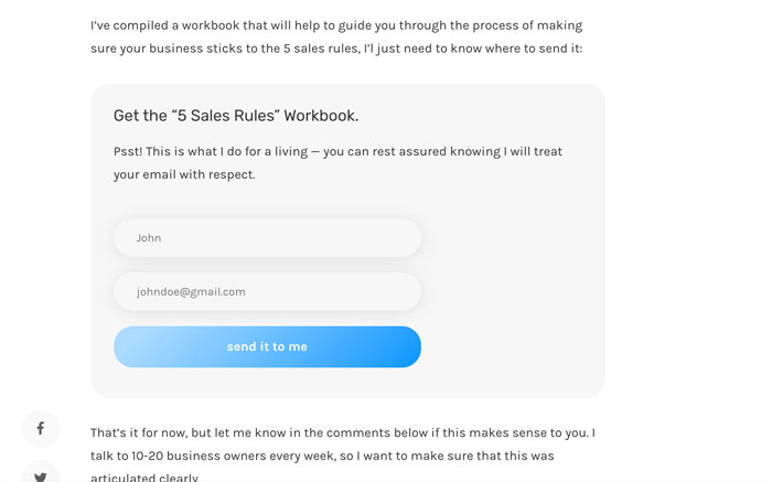
For users that are a bit warmer, you want to ask for their email address in return:
- Webinars.
- E-Books
- Case Studies
- Industry White-papers
Here’s me using a simple email opt-in in my article on “5 rules to get anyone to buy anything from you”:
Once you have their email, you want to slowly drip relevant content to them over the next year or so to stay top-of-mind and relevant to them…all the while building trust and showcasing the value you can bring to the table.
Step 6: Remember the human.
When was the last time you read a paragraph of text on someone’s homepage? If you’re like most people, you almost never do that, and this is what I’m getting at what I say “remember the human”.
When was the last time you read a paragraph of text on someone’s homepage?
At the end of the day, you’re building experiences for other humans to consume, so you have to consider human nature when making design decisions.
This should underpin every little design decision that you make on behalf of the customer.
Some Actionable Takeaways
This goes back to Step 1, but I want to reiterate some other “human-centric” design tips that you can use today:
- Minimize text where you can.
- Maintain proper use of screen real-estate (people’s eyes move from left to right then top to bottom, so place content accordingly).
- Use color to control attention (bright saturated colors usually pull attention, so use them for CTAs and important labels).
- Try to avoid anti-patterns as they’re shortsighted and bad for your brand (I’ll touch on this in a later article probably 3 years from now when I get around to it).
Step 7: Start over, but pretend your user is very, very drunk
Once you’re “done”, you’ll realize that you’re really, really zoomed into the little details of your experience.
Go to sleep.
…and when you come back the next night, grab yourself a bottle of wine and down it, then try to sign up for your demo (alternatively, you could just squint your eyes really close together and sluggishly use your mouse without reading anything).
You want your site to be so easy to use that even a drunk person could use it.
In all seriousness though, usually the second time you look at something you’ll notice a few things that are glaringly wrong, so it’s important to take a step back and evaluate the whole experience of the demo on-boarding process before declaring victory.
Want to build your own highly-converting SaaS landing pages?
Check out my “SaaS CRO Checklist”, and interactive PDF that contains just about everything you can do to boost conversions.
Some other considerations
You’ve been quite patient with me reading this massive wall of text. I could go on and on for days about this stuff, but this is as good a place as any to stop for now.
In closing, here’s a couple more considerations that I omitted for brevity’s sake:
- Avoid page builders like BeaverBuilder and VisualComposer as they really mess with the HTML markup and are notoriously bad for page speed.
- Don’t underestimate the importance of page speed in the larger picture of the user experience. If the page doesn’t load, then you don’t even have a chance to try to convince the user to sign up for your demo.
- Consider the mobile experience because traffic is trending mobile (and to be frank it’s 2019 so if your site isn’t mobile-responsive yet, you’re doing something seriously, seriously wrong).
- Remember that this is an ongoing effort, and practices like A/B testing are critical to optimizing the experience as you learn more and more about your customer.
I hope this helps you plug some holes in the proverbial “leaky bucket”.
…and remember: at the end of the day, just keep it real and keep it human, and your site will do just fine.