This one’s a little different from my usual project: it’s not a SaaS product, and I wasn’t asked to come in and completely re-do their entire site.
The guys at Reach Cambridge approached me because they wanted to streamline the application process for their summer school. Reach Cambridge boasts an incredibly-unique summer school experience, but that same experience didn’t make it’s way to the website.
The Problem
Taking a step back, we put together a problem statement:
The Reach Cambridge application process is cumbersome, and doesn’t inspire much trust in the brand. Because of this, people are abandoning the process before completely signing up.
For context, here’s the registration form that was being used previously:
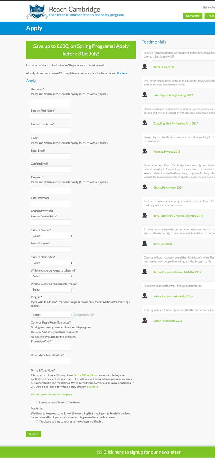
I was immediately suspicious that there was some serious room for improvement here. Often, if you just handle the low-hanging fruit in a user’s experience, conversion issues can sort themselves out.
As always though, we put together a series of hypotheses:
- The abundance of fields are causing people to bounce off the page.
- This was magnified substantially on mobile devices.
- The colors used in the experience were not inspiring confidence in the brand.
- The site aesthetic generally caused some trust issues.
Now, we had to test these hypotheses before making any drastic changes.
A Quick Note
While I was hired to do some consultation on the conversion issues they were experiencing, Reach Cambridge was going through a total redesign with another firm.
This presented a unique challenge for me as no matter what changes I suggested, I had to make sure that they resonated with the new brand aesthetic, too.
With that, we began testing our hypotheses…
Was the large amount of fields throwing people off the page?
In order to validate this hypothesis, I wanted to go direct to customers. Specifically, it would have been ideal to talk with two segments:
- Customers that ended up signing up with Reach Cambridge, and
- Non-customers that ended up registering with a competitor.
As is usually the case, we didn’t really have access to the second group, so I opted for a secondary metric: reviewing analytics data.
First, I got on video calls with some of the current students to try and extract some insights from their experience. Clearly, their parents were the ones that paid for the program, though having gone to summer school when I was a kid myself, I know that they had some sway in the decisions process.
I learned that a sense of community was very important to them, and all the pictures and videos that RC had on their site helped to reassure them that they’d meet some awesome new friends there.
There wasn’t really much concern with the form fields, though I was suspicious that since they never had to deal with them directly (as the parents were the ones ultimately filling them out), that they weren’t as directly exposed to them.
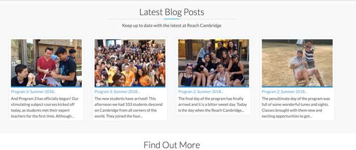
Next, I combed through analytics data to try and see what the browsing behavior looked like before jumping to conclusions.
After filtering for their most popular season (Feb through April), I discovered the following:
- 2.1% of all traffic would hit the registration form, then
- 5% of that traffic would fill it out.
- This resulted in an overall raw conversion rate of about 0.1%.
However, having 5% of the traffic that hit the registration page fill out the form in its entirety was interesting. There were a few things we had to consider to contextualize this number:
- Many of the people that hit the /apply page were being guided there from recruiters from overseas.
- Generally, anyone that makes it that far in the funnel is much more likely to convert than otherwise.
- Perhaps since the students were so enthralled by the sense of community, once they’d decided on a program, a clunky registration form wasn’t going to stop them.
Taking a closer look, it seemed like despite the 50% exit from this page, most of the traffic that hit this page was spending quite a bit of time there:

All of this to say that a significant chunk of people that reach the /apply page actually stay there for quite a while. If only 5% of them are converting, what’s the other 45% doing for 2 and a half minutes?
[…] about 2.1% of all traffic would hit the registration form, then 5% of that traffic would fill it out. This resulted in an overall raw conversion rate of about 0.1%.
My guess is that they start filling out the form, then get thrown off by either the “Programs” dropdown which prompts a whole bunch of questions (“what is a program”, “is that different from a course?”). Alternatively, they may just be giving up and navigate away halfway down. Hard to say without screen-recording software.
Ultimately, it’s hard to say whether or not a 5% conversion rate at this point is great, however I think it’s fair to say that there was room for improvement both in the metrics department (to see what’s actually happening), and in the conversion department.
Were the colors and the site aesthetic a problem?
Qualitative metrics like these are always a pain to measure.
Yes, to some degree you can use your design intuition to determine whether or not the site aesthetic is causing people to look at other options. However, this is often quite dangerous as a dated aesthetic can sometimes make a brand feel more relatable (and ironically boost conversions).
I was quite certain that there was an enormous room for improvement here, though I made sure to get a feel for what the students thought in my interviews with them.
These conversations with unbelievably-insightful. Not only did we learn that “the lady is annoying” (referring to an image of a lady in a popup chat window on the homepage that was being disruptive to the browsing experience), but we got an understanding of a general sentiment on the site aesthetic.
Here’s what they said:
Yeah, it seemed like a really old site, but we’d heard lots of good things about them, so we pressed on with the application.
Did this mean that we could get by without redesigning the site completely? Possibly, but what I took from it was that Reach Cambridge had a system of referrals and past student testimonials that were so compelling that they outweighed the negative effects of the dated site aesthetic.
To me, this felt like an opportunity in disguise: we could emphasize the past student testimonials more on the site, and have them work hand in hand with a modern, performant web experience.
The Solution
We decided that since a site-wide redesign was already on-going, that I’d take the lead and optimize the on-boarding form. There was a mutual understanding that although we’re not certain there will be an enormous positive impact, it can’t hurt to make applicant’s lives easier.
So, with that, we kicked off a quick little redesign process.
Re-Imagining the Registration Form
Immediately after seeing the old registration form, I had a few things jump out at me as “quick wins”:
- Categorize the form fields to minimize the amount of data that a user has to process at once.
- Indicate the user’s progress in a progress bar instead.
- Show the user some sort of overview of their purchase as they move through the application.
- Use hints and labels to guide the user along and answer any simple questions they may have about unique fields.
- Try to keep users inside the form as much as possible, giving them as much information as they need to continue moving through.
- This was particularly important because of the “programs” dropdown, which I was suspicious caused people to bounce off the page (so they could learn more about what a “program” really was.
- Save their progress so that if they do leave the page, they can return and resume the registration experience.
These are more or less best practices, however the magic was in the implementation.
First, instead of showing every single field in one big page, we broke it up into logical groups, and had users fill each section at a time.
This gave a sense of progression, without overwhelming them:
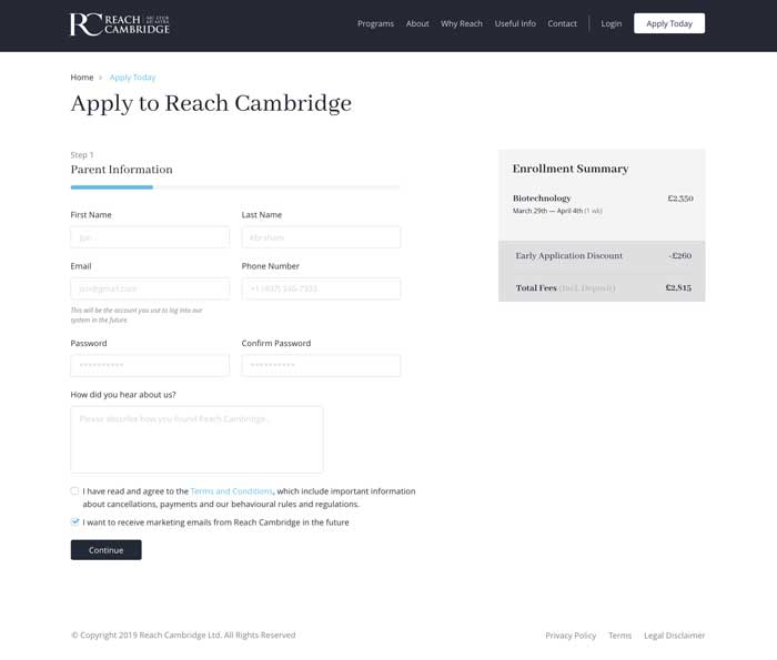
The progress bar you can see at the top, coupled with the overview item on the right, was intended to give users an understanding of where they were during the process, and what they were buying at all times.
After we really started to put some focus on the registration form, it turned out that there were several really complicated parts of the signup process that were being handled manually by the RC staff in the previous iteration.
The third step here showcases that, and how we got around that complication using hints and labels to guide the user:
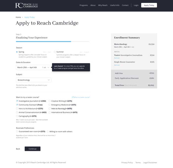
Of course, we made sure that the whole process was fully responsive and easy to use on mobile devices as well.
Modernizing the Site Aesthetic
As I mentioned previously, the RC team was already quite involved in a redesign with another firm. Because of this, I only touched a few components to modernize them.
In particular, I helped to streamline:
- The site-wide header navigation.
- Form elements site-wide.
- The site-wide footer.
Much of this was then taken over and managed by the other design firm.
Results
As of February 2020, I am planning to meet with the owners so that we can monitor how the new on-boarding flow has had an impact on their signups for the Spring 2020 semester.
In the meantime, here’s what Jon had to say about our time together:
"We had a superb experience with Marc [...], whose forensic look at our webpages was really exceptional. We would definitely recommend!"

Jon McGoh
Reach CambridgeThe final site experience is much more modern than it was before. More importantly though, we’re really doing our due dilligence to get out of hte user’s way, and make it easy to register for a summer camp at Reach Cambridge.
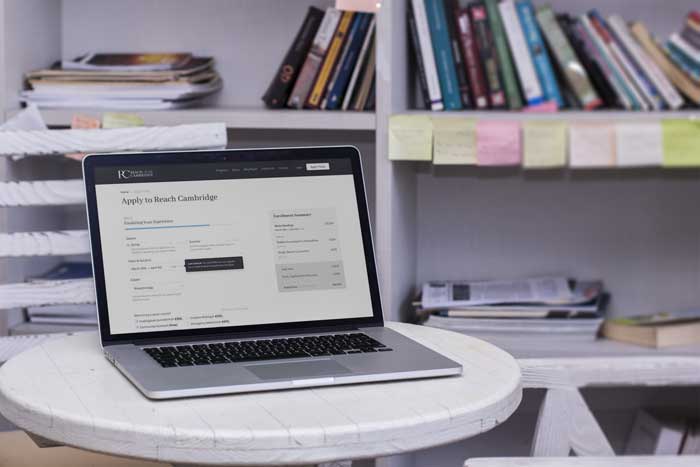
I’m genuinely very excited to see how we can really make this resonate with students, and I’m intensely curious to see how these changes will make their way to the bottom line for the business.
Key Takeaways
A few lessons that I’ll be taking with me from my experience with Reach Cambridge:
- Although you can do “OK” without them, there’s no substitute for genuine customer interviews.
- The reasons that people buy things are often obscure and complicated. You can’t make assumptions about this without first testing them!
In the end, I’m really satisfied with how things turned out, but stayed tuned for more updates as we continue to iterate.
