Alright so we’re straight up living in “the twilight zone” right now, and I’ve personally been locked in my office going ham trying to learn more about my customers.
In the past 3 weeks alone, I’ve probably visited more B2B SaaS sites than anyone else on the planet (well over 3000).
I’ve seen the good, the bad, and the ugly.
(…and for the record, if I have to dismiss one more intercom auto-popup, I might genuinely lose my sanity. 🙂)
Today, I want to do my part to inject some positivity into the LinkedIn ecosystem, and share the 5 best SaaS homepages that I’ve found in the past 2 weeks.
Although I don’t have direct metrics, I would be shocked if these sites aren’t conversion machines, landing new trials and demos left and right.
I hope you get some value out of it — enjoy!
Mighty Networks
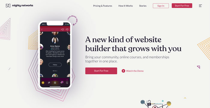
When I first stumbled across Mighty Networks, I almost snapped my wrist trying to hit the bookmark button on Chrome.
It’s hard to describe what they’re doing well without dedicating an entire article to it, so here’s some of the highlights:
- Their value proposition (and the copy, generally) is incredibly-clear.
- It’s obvious to me (as a visitor) that they want me to click that “Start for Free” button.
- Scrolling down the page, you find that they’re speaking to the specific pain-points of their customers in very natural, human language.
I got a chance to have a quick chat with Gina Bianchini, the CEO of Mighty Networks, and she shared some insights on how they put their site together.
Gina shared with me how they did customer research for the site redesign:
“We have a Mighty Network for our “Hosts” (what we call our customers) called Mighty Hosts. There are 20,000 Hosts there who are sharing their questions, feedback, and ideas, so we feel like we are doing customer discovery every day.”
They’re using their own tool to communicate with their customers…brilliant!
With all this, it’s no wonder how they were able to deliver a knockout homepage that converts well.
“[…] we feel like we are doing customer discovery every day.”
Your customers have the answers to your sales & marketing problems: you just have to ask for them!
Together
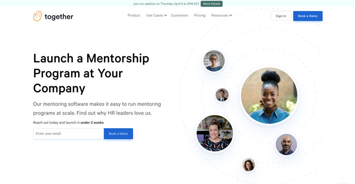
When I found Together, their homepage header copy punched me right in the lizard-brain and I just had to put them on this list.
Just look at that clear value proposition! If you were even remotely considering launching a mentorship program in your company, you immediately know you’re in the right place.
That’s world class, folks.
Here’s a couple more reasons why they’re on this list:
- Their onboarding flow is stupid simple: you literally just enter your email address and pick a time for a demo. That’s it!
- They answer pre-sales questions very elegantly with screenshots of their application.
- Their use of design pulls your eyes to the important parts of the text/imagery so I can get the “gist of it” without having to commit to a tiresome read.
I had the chance to talk with Tyler Benning, Together’s design lead, and asked him a few questions about how he got to this masterpiece.
Here’s what he had to say about building the marketing site for customers:
“Each page of your site should have a goal to convey a specific message. The user value should resonate equally through the product and marketing materials. Marketing sites aren’t rocket science, but require lots of fine tuning over time to get right.”
He also shared a super actionable copy hack that I love:
“Sometimes the best copywriting comes from a direct customer quote or a line your sales rep uses in a demo.”
When you’re really listening to your customers, little fragments of their reality will make their way into your world.
Empathic listening is what enables you to build something that really converts, and Together is proof of that!
Integry
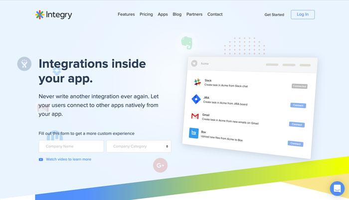
It’s rare that a company can tickle my novelty circuits these days, but somehow Integry found a way.
I can’t really do this bad-boy justice in text here, so I’ll give you a minute to click on the link and check it out in your browser.
…
…
I KNOW, RIGHT?!
Integry is a world-class example of a company that knows how to explain their solution without using words.
It’s so clear from just looking at their homepage that they help you integrate your application with another existing application (Slack, Discord, etc.)
A couple other things that really got me jazzed on their site:
- You can actually interact with the homepage hero, and add in your own company’s details, which customizes the entire experience.
- They really focus on listing the benefits of their solution (i.e. 40% lower churn), not the features.
- Like most of the other examples here, their onboarding flow is two clicks (and a tiny 3-field form).
I had a chance to talk with Mohammad Nasrullah, the CEO of Integry, and I asked him about their customer discovery process too.
Here’s what he had to say:
“[After defining customer personas…] we then take a persona and talk through what problems they face, how a day in their life is like. The result is a use-case. Different personas can have a common use case too.
We then takes these use cases and organize them into common themes and categories.
Each theme is then addressed with a piece of content. That piece can be a section on the website, an entire page or a subsite. This is a starting point, we keep iterating over this.”
I had an inkling that there was some sort of scientific process behind their site, and here it is!
This is one of the most detailed (and practical) approaches to customer-centric design I’ve ever seen. Hats off to their team!
Mohammad also mentioned that they used The Startup Owners Manual by Steve Blank as a reference.
(I’ve got a copy in my shelf right now — it’s basically the blueprint for anyone looking to start a new business.)
Tandem
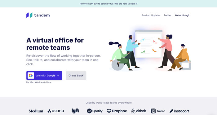
After finding Tandem, I was initially drawn in by how timely their value proposition was (that’s right…I’m talking about you, ‘rona!), and when I scrolled down further, I felt compelled to add them to this list.
You’re probably starting to notice a recurring theme here, but this is what Tandem does really well:
- Exceptional visual explanation (with GIFs) of the benefits they offer their customers (not the features of their solution).
- It feels like they are speaking directly to me, with all the natural language they’re using on the site.
- Despite having a rich visual experience, their load times on mobile are still lightning fast.
I never got a chance to talk to anyone on the Tandem leadership team, but man I would be surprised if they weren’t getting conversions out the wazoo right now.
Glidr
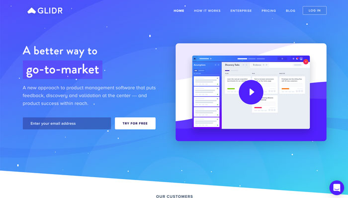
Have you ever visited a site and shortly after realized that your socks have made their way to the other side of the room?
That’s what happened to me when I found Glidr.
Specifically, here’s what they’re doing that caused my socks to exit stage left:
- Although they solve a somewhat general problem (product management), they’re making their solution more relatable by showcasing specific use-cases in their header text.
- Their use of visual flair is really captivating, but it doesn’t get in the way of clarity on the site.
- Their intercom widget doesn’t start screaming at you when you first visit the site! 😉
I really loved how Glidr was able to really pull me in and sell me emotionally on their brand (with all the flair and modern use of color).
I’m going to be sending future clients to their site to show them an example of a company that does visual flair right!
Some Final Thoughts
Okay, so there’s clearly some overlap between all the sites in this list.
In a nutshell, here’s my 6 criteria of a “highly-converting” homepage:
- The page loads in under 2 seconds on a 3G mobile connection.
- (For the homepage specifically…) There should be a very clear value proposition & the text should be written using natural language.
- It’s very easy for potential customers to do the thing you want them to do on the page.
- Pre-hire questions are answered either visually or explicitly in the site copy.
- Social proof is emphasized somewhere on the page.
- The visual flair inspires, but doesn’t interfere with the user journey.
If you get these 6 principles nailed down, your site is going to be fine.
In the end, just make sure you’re always staying plugged-in to the wants and needs of your customers — it just makes everything easier.
Thanks for reading, and stay safe out there folks!