Vincent, the founder of 01 Partners, approached me looking for a solution to a complicated problem.
Him and his team together ran 01 Partners, a firm that helps to facilitate healthy win-win relationships between a marketplace of investors, and young companies that needed some operating capital. However, his current site was a “leaky bucket” that was harming his brand (and ultimately the bottom line), so he wanted to do something about it.
We ended up building out a really stellar solution together, and this is the story of how we made it happen.
The Problem
Most business owners that come to me already have a site. I like to ask them why they would “fire” their site if it were an employee of their company.
(Aside: I know this is a super weird question, but i’ve found it helps to cut through the generalizations and get to the often harsh honest truths about the site’s performance).
After asking this question, we uncovered that the problems with it were twofold:
- The experience was confusing and it wasn’t very intuitive for either customer segment to end up doing business with 01.
- The site didn’t “feel” very modern, which caused some trust issues to emerge (especially with newer companies).
So I got to work learning everything I could about 01 and the larger market of financial advisories.
After doing a bit of discovery, we came to the conclusion that there were 2 distinct customer segments that we had to appeal to:
- Investors looking to see substantial returns on their investments.
- Companies that needed capital to grow (and were perhaps a bit new to the business world and needed some help).
Digging deeper, I wanted to know a little more about what was important to the people in these segments, so I could design an experience that would ultimately resonate with them.
Investors held a complicated set of concerns that had to be addressed on the site:
- Is 01 an established company themselves? Who have they worked with in the past?
- How long have they been doing this?
- How big is the company?
- How are you different from other financial advisories? What are you doing to improve my chances of seeing a return on my investment?
Companies also had their own set of concerns:
- Is 01 connected to actual investors?
- Will we get engagement from investors, or just working capital?
- How much does it cost?
- What services do they offer outside of investor relations?
So, at this point, I had a really solid idea of the questions that people visiting their site would generally like answered. I would need to answer them in some way.
In my experience, there’s really 2 things a good website does for you:
- It answers any “pre-sale” questions that prospects have about your product/service.
- We answer them explicit or implicitly on the site.
- It influences them to move forward in the buying cycle (in a way that’s relevant to where they already are in their own buying cycle).
- I solve this with compelling copywriting and a really modern aesthetic.
So, I now what a big list of questions that needed to be answered, and a whole suite of brand direction from talking to the 01 marketing team — it was time to build something out!
The Solution
I always like to start with abstract solutions, present them to the business owner, and then only move to the next step once we’ve reached a mutual understanding of the approach.
Revisiting the problem statement, there’s 2 issues I need to resolve here:
- The experience is confusing for both customer segments.
- The brand “feel” was misaligned and projecting a poor company image.
Solving the first problem was simply a matter of answering the questions we outline previously, in a way that is intuitive and logical for the business. This is really what design is all about.
Here’s how I decided to answer each question we had from earlier:
- Is 01 an established company?
- The site feel would be one of an established company — very polished and clean.
- We’d list out companies that 01 has worked with in the past, along with testimonials from business owners and investors.
- We’d emphasize how long 01 has been doing business.
- How are you different? Will I see a return?
- We’ll have to explain the individualized services that 01 offers pretty early in the experience, and then explain how those services help investors partner with more profitable companies.
- Is 01 actually connected to investors? How many?
- We should emphasize the breadth of their network visually somehow.
- Will we get engagement from investors?
- Again, need to highlight how 01 helps to do this relatively early in the site experience (probably above the fold).
Solving the second problem required a more qualitative approach, and given the broad range of personality types in 01’s customer distribution, I had an added challenge of building something modern and cool, while still keeping it relatively conservative and easy to use for the (typically older, no-nonsense) investors.
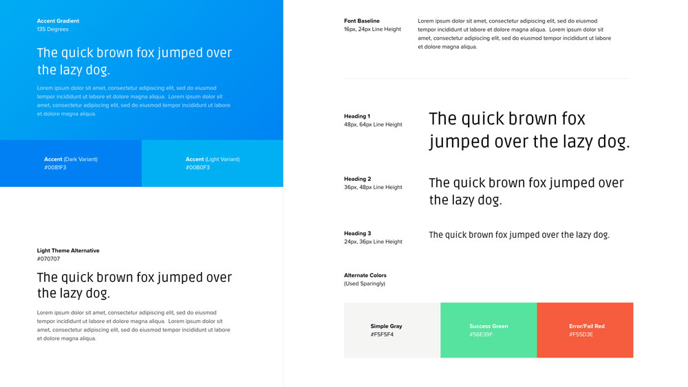
Ultimately we ended up putting together some rather stellar brand guidelines (if I do say so myself):

As you can see here, the blue tones in the gradient give off a very clean and professional sense, while the typography gives them that modern edge.
Now that I had more of a foundation for the aesthetic of the site, it was time to start building out the experience…
The hero (above the fold) section, is almost always the most important part of the experience. This is where we need to (1) explain what the business is/does, and (2) answer the most pressing questions that customers have.
Solving the first problem was simply a matter of answering the questions we outline previously, in a way that is intuitive and logical for the business. This is really what design is all about.
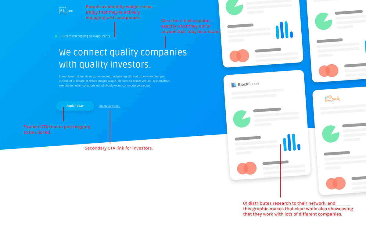
Here’s what I came up with in my first attempt:

Of course, in retrospect now, I can see where this initial design missed the mark. After a couple rounds of feedback, we made a few major changes:
- The above the fold experience doesn’t clearly illustrate that this is a multi-sided marketplace.
- Although the research illustrations get the point across, it doesn’t seem important enough to be the first thing people see on the page.
- They also pull the viewer’s eye toward them, distracting from the primary experience (applying for an opening).
- The slanted section separator is nice, but we wanted something a bit more modern for 01.
All of my engagements are inherently collaborative, because although I know web design in and out, I simply don’t know your business like you do. So, for projects to be successful, it’s important that my clients let me know if they think we’ve missed the mark somehow.
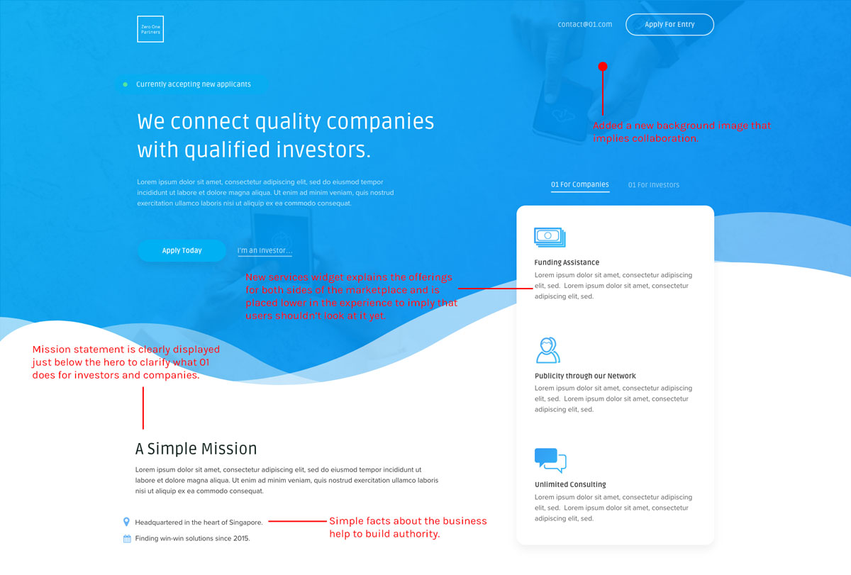
Here’s what we came up with after iterating on it a bit more:

As you can see, this is a much more appropriate hero experience for the company, and handles the multi-sided market problem really well.
We continued to do this for the rest of the sections on the site (you can see them all by clicking on the image preview on this page), but I’ll quickly summarize some other features we implemented and how they had an impact on the site’s overall performance:
- We made sure to include tons of imagery of the big brand names that 01 has worked with in the past to reassure people on both sides of the marketplace that they were an established company.
- We included lots of discrete metrics that helped to highlight the network reach they had. This also helped to build authority for them.
- We made sure that testimonials from real people were displayed front and center so that potential customers/investors could feel connected to the human element of the brand.
- We offered to share one free research example with anyone that shared their email with us to help capture prospects that might not be ready to move to the last few steps in the buying cycle (actually sign up for the service).
As you can see, we ended up with a damn sexy site — but how does it perform? Well, I’m going to be tracking that over the next few months to get some real metrics.
In the meantime, ask yourself: after visiting a site like this…wouldn’t you feel excited to partner with them?
Key Takeaways
With every project, I like to learn and grow. Even just linear growth is crazy useful for someone like me.
Here’s what I learned working with Vincent and the team at 01 Partners:
- Biggest Takeaway: It’s very easy to let your ego get in the way of making clear design decisions. Because something looks good doesn’t mean it’s a clear experience!
- Timezone challenges are a big risk that need to be mitigated early with proactive expectation management.
- Copy has such a tremendous impact on the site “feel”, so make sure to spend extra time refining the message before you launch anything.
