Late last year, I was approached by the BizNews team about a project to “simplify” their website, while bringing it into the rich new world of digital publishing with a modern rebrand.
I’ll admit, when business owners contact me and ask for simplicity, my heart skips a little because I firmly believe if everyone thought this way, the world wide web would be a much more friendly place.
Emboldened by a new sense of purpose, we kicked off what was going to be one of the most intricate and personally rewarding projects I have ever completed, and today I want to document what we did, why we did it, and how it ended up working out for the BizNews team.
The Problem
For context, here’s what the BizNews homepage looked like when I arrived:
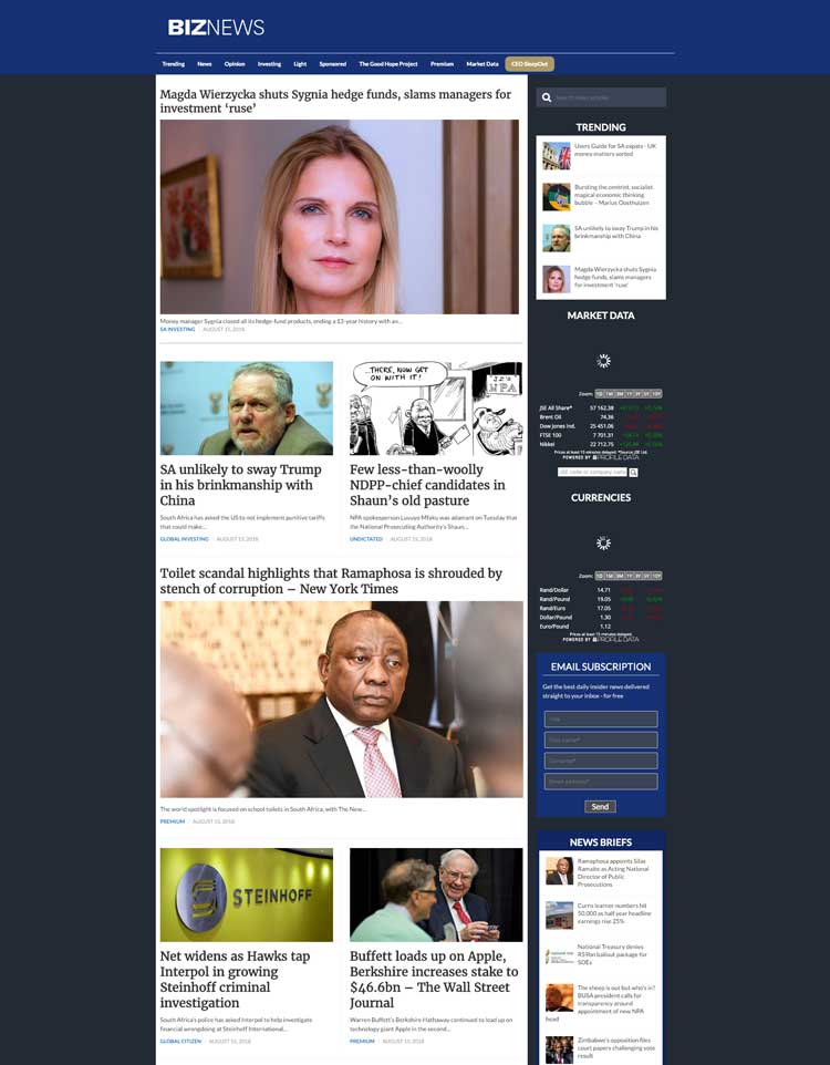
Now, as you may already know, all of my projects start with some sort of “discovery” phase. This was no different for BizNews, although we ended up spending an incredible amount of time just figuring out exactly what we needed to do to make this transition as smooth as possible.
Since BizNews is the primary news outlet for South Africa, they understandably get quite a bit of traffic. So, any downtime caused by a new site migration would mean hundreds of thousands of people wouldn’t be able to access the site for that period. Yikes.
We had to get it right the first time, so we spent the time we needed to really analyze what had to be done to pull this off with as few roadbumps as possible.
During this phase, we also drilled down into the problem that I was tasked with solving, so I could be very sure that after we finished up, the BizNews team would be very satisfied with the solution. First, we got some clarity on the ultimate goals of the site:
- Priority #1: Deliver timely & relevant news content to those that are using the site (of course).
- Priority #2: Entertain and engage subscribers with rich media content (podcasts and videos).
- Priority #3: Deliver more analytical news content with a global context for premium members.
- Priority #4: Monetize the site through relevant advertisements slots and the premium membership.
Given these priorities, we continued to flesh things out further to get to some tangible problems with the site that were preventing these priorities from happening. Here’s what we defined as the core issues that needed to be resolved:
- Problem #1: The site branding & color scheme was a bit distracting and harsh, which ultimately impacted the reading experience, and reduced the chance that users would want to upgrade to a premium membership.
- There were also some issues with the main navigation menu being quite difficult to use, as you can see in the photo above.
- Problem #2: The site took a tremendous amount of time to load (when I arrived, it took about 19 seconds to load), which caused visitors to leave prematurely and further damaged brand trust.
- Problem #3: The experience of signing up for a premium membership was very unintuitive (see the images below), with a couple un-styled pages sprinkled in.
- This meant that anyone who wanted to sign up had a few more hurdles to jump through first.
- Problem #4: The usability problems were exacerbated further on mobile screens.
- Problem #5: There wasn’t any technical documentation for the site, which made it untenable to maintain.
To highlight one of these problems, here’s the page that users had to go through when they wanted to sign up for a premium membership:
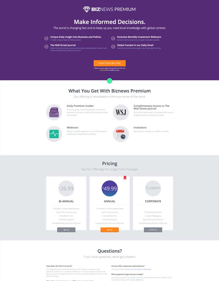
Honestly, this page wasn’t that bad at all…though it felt disconnected from the rest of the site, and looked a bit outdated.
After making it through this page though, users were taken to this next screen, where they had to eventually enter in their credit card information:
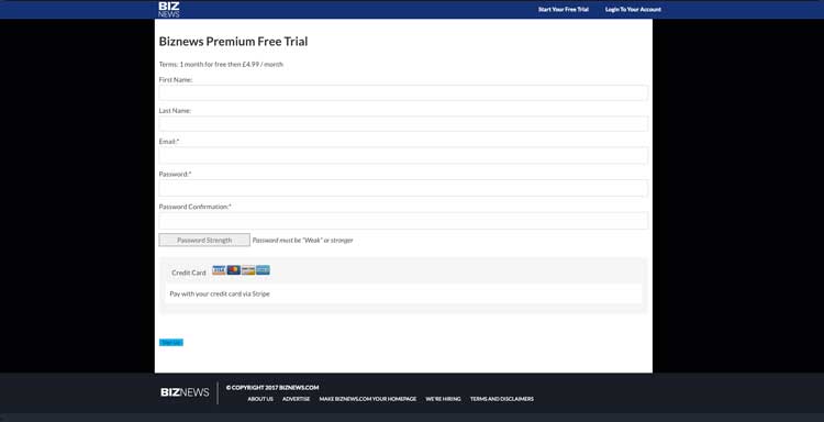
It goes without saying that you’d probably be a bit hesitant to put your card details in there.
I could spend time listing the symptoms of these problems, and how they made their way into the big picture (lost conversions, less time spent on the site, lower user engagement, etc.), but what really matters is that the BizNews team knew something was fundamentally wrong with the way their site was working.
They came to me with a very, very, painful problem — and now I’d like to address how we solved it…
The Solution
Here’s a sneak peek of the final site experience we decided to implement:
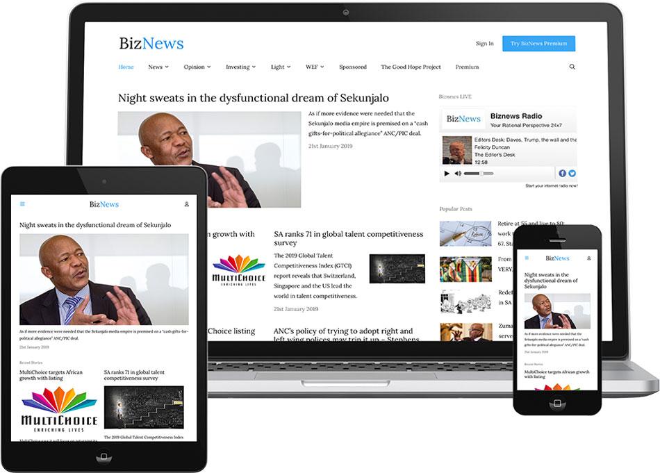
As you can see, this is a rather dramatic improvement over the last iteration of the site…but the value in a case study is in the “how”, so let’s break it down a bit.
The Branding and Color Scheme
Other than being an identifier for a company, a brand represents a deeper, complex idea for which the company usually stands. For BizNews, they simply wanted their brand to reflect the same integrity and quality that they pour into each and every one of their articles.
However, their previous branding with the really rudimentary logo, and clashing deep blue color schema sent across a disconnected and uneasy sensation to viewers. This had to change!
As always, I started by asking a ton of questions.
- What kind of feeling did they want to portray?
- Were there any others in the industry that they’d like to use as inspiration?
- What feedback were they getting from real people about their branding?
- What were the reasons behind the current branding?
After quite a long set of discussions, and a series of mockups, we decided to stick to a simple color scheme and brand mark (much like the spirit of the previous mark), but modernize the colors and typeface dramatically. We revamped the (1) logo, (2) color scheme, and (3) typography to give it a much more modern feel.
Here’s where we landed for the logo:

As you can see, it’s much more clean and modern, while still adhering to the simplicity that the first logo had going for it. The typography also needed a bit of a readability audit, and we wanted to use a more modern typeface as well:
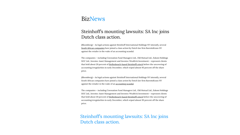
Finally, the color scheme was given a facelift as well. Of course, given that this was a news site, we would be leaning on black and white quite a bit, but now we’d have more of a splash of color with the modern blue accents:
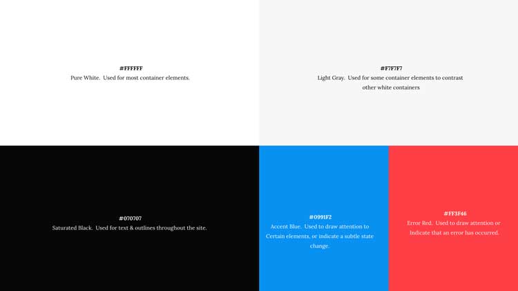
In all, this left us with a rather solid foundation from which the site itself could grow — but we weren’t quite ready for that yet.
The Premium Signup Experience
The next problem we had to tackle was how we could “remove the friction” between evangelical BizNews supporters, and the premium offering the team wanted to promote.
During the time I spent with the BizNews team analyzing the problems we were facing and understanding the realities of their business, we drilled down to a few key reasons why the premium signup option wasn’t converting as much as it should have been:
- The aforementioned branding issues.
- Users had to click through 3 pages before they had an account.
- The form on which user’s filled out their credit card details did not convey a sense of trust.
- There was no clear CTA in the site navigation to move users towards a premium account (this was fundamentally an awareness issue).
Of course, this assumed that site visitors were even interested in the additional benefits of a premium offering, though in the spirit of taking a more scientific approach, I find it’s always best to remove the obvious roadblocks first, before tackling those kinds of questions.
Again, I got to work, and we made some really significant changes to the site experience. First, we made sure that the navigation always clearly displayed a very visible CTA, suggesting that users sign up for the premium offering:

At this point, I would consider it fair to assume that any site visitor would at the very least be aware that there was a premium offering. But after awareness, comes influence…so we had to modernize the premium landing page a bit:
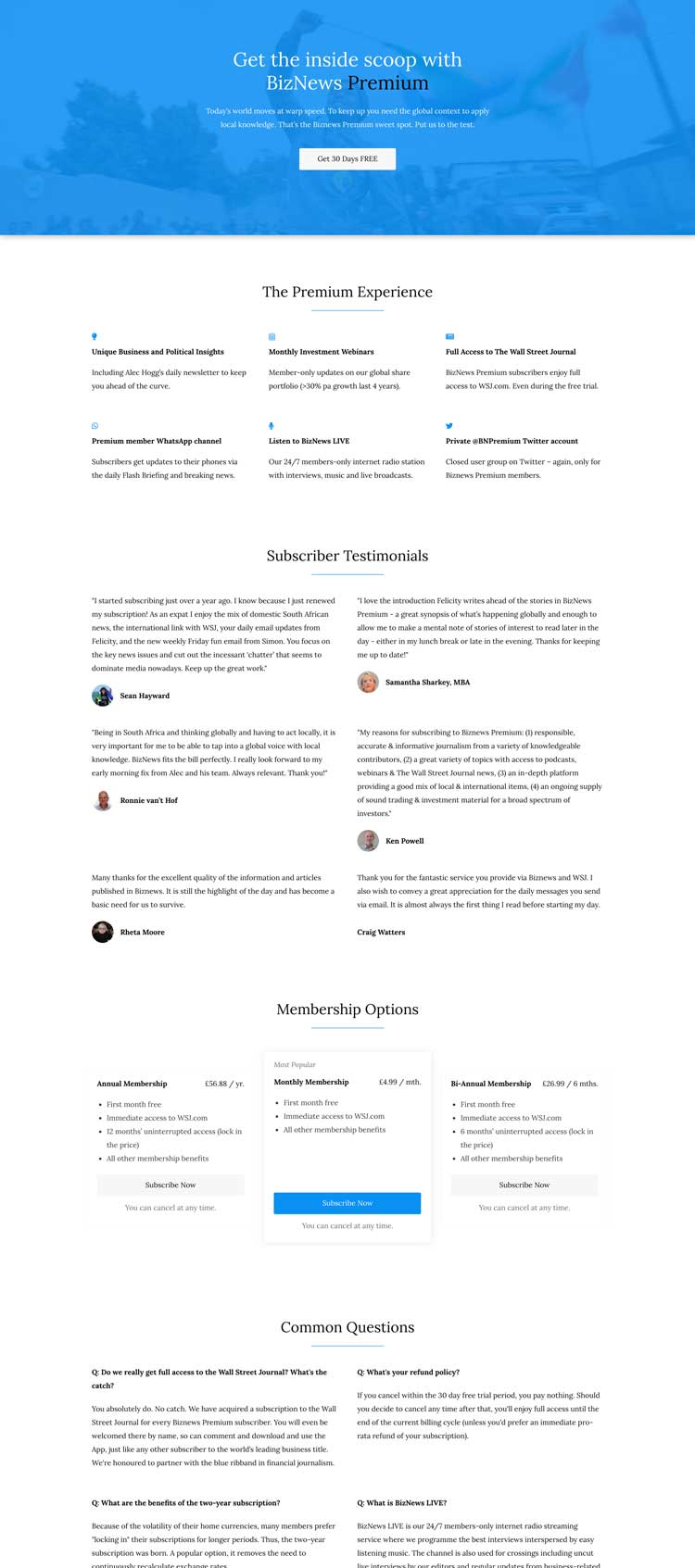
As you can see, this iteration is much more clean and modern. It really generates an aesthetic of an established company, with whom a premium membership would be quite valuable! 😉
More specifically, I wanted to…
- Clearly highlight the benefits of joining BizNews Premium.
- Make it very easy for those that decide to do so to move forward with the process.
- Help the users feel relaxed and trusting with a new modern color scheme and brand “feel”.
- Outline some past subscribers that really loved working with BizNews Premium.
- Answer common questions users had about the service.
I think this landing page handles all of this quite well.
Finally, I had to do something about that scary credit card form we saw earlier! Unfortunately, my hands were tied here a bit because of the platform that was being used for memberships, though nonetheless I was able to re-style this form, too:
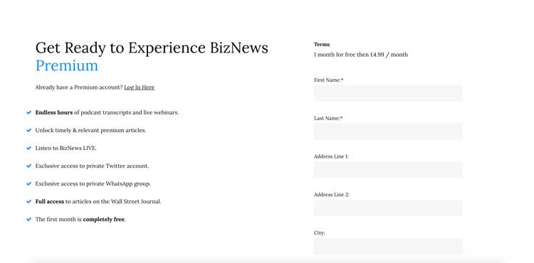
It’s a world of difference, and I’m absolutely certain that conversion metrics will confirm this in the next few months.
The Poor User Experience on Mobile Screens
We all know it’s heresy nowadays to consider building a site without mobile screens in mind. Sometimes, it’s a challenge to actualize that…that’s where I come in.
I didn’t really do anything special with the BizNews site, other than optimize the way that the containing elements responded to changes in screen widths using CSS media queries. That’s it! No magic beans here.
The most substantial changes to the site on mobile screens was that the navigation menu needed to be very simple and easy to use (as opposed to it’s predecessor). You can see the result here:

This is dramatically easier to use than its predecessor, and I’ll be monitoring mobile engagement metrics to see if it has had a positive impact on session duration.
It was also quite important to the BizNews team that their articles were readable on mobile screens, and fortunately for them then “news site” archetype is one of the most mobile-friendly options that exist today.
Either way, you can check out the site next time you’re browsing on your phone and see how easy it is to use.
The Lack of Technical Documentation
When I arrived, the BizNews team didn’t really pass the “bus test” really well.
If someone critical to your mission as a company was suddenly (and tragically) hit by a bus, would your business grind to a halt?The “Bus Test”
There was very little technical documentation on the site, which made the initial discovery phase for this project much longer than it should have been. The leadership wanted to externalize that knowledge as much as possible so that they could remain more agile and not be so beholden to those with that knowledge in their heads.
I painstakingly documented absolutely every change I made to their site in a massive handover document, which they can now reference and pass around their team when they need to make a tactical change to the site.
…Even better: if I happen to fall of a cliff, they won’t lose all that business-critical information!
I also created a ton of training videos to teach their editorial staff how to do the most common tasks on the site.
The Site Performance Issues
The BizNews site load time was almost certainly one of the largest problems with the site. It was absolutely impacting the user experience, and forcing mobile users to download tens of megabytes of unnecessary data.
Ultimately, this had a twofold cost:
- Evangelical users had a poor user experience and had to waste their data when browsing on mobile phones.
- The BizNews team was clearly losing brand reputation, and cash flow from users that would have otherwise subscribed to their premium offering, or stayed on the site longer (and thusly viewing more advertisements).
We solved this problem by going to all-out war with the current tech stack:
- We performed a massive audit of all the plugins on the site and purged those that were no longer being used.
- We also heavily documented all the plugins that remained, so that they don’t get back to “plugin bloat hell” any time soon.
- We changed the theme framework to instead use GeneratePress, which is one of the simplest performant WordPress themes out there (much love Tom!).
- We forced the theme to “lazy load” images, iFrames and videos so they the site could load all the text content without having to wait for rich images.
- We trained the editorial staff on how to upload web-friendly, progressive JPEG images.
Finally, and perhaps most importantly, we collaborated with Mike from wp-bullet.com (and by the way, if you find your site is running slowly, please do yourself a favor and reach out to him), who is helping us iron out all the more nuanced kinks in the system to get it loading even faster.
After all this, we ended up lowering the first meaningful paint on the site from ~19 seconds to ~1.2 seconds, and we’re hoping it gets better as time goes on.
Results
I’m keeping a very close eye on the site’s conversion metrics, and I’m staying plugged into the user feedback loop so I can tell if we made a genuine impact.
I’ll report back here when I have some tangible results worth discussing further.
In the meantime, here’s what Alec had to say about our time together:
"[Marc] has been an absolute pleasure to work with: professional, disciplined and knowledgeable. Marc appreciates that the quality of the execution depends on the attention invested in pre-project planning. [...] Weeks after sign-off, when unexpected gremlins surfaced, Marc always found time to support us. If one was able to score someone 20 out of 10 I would do so. It has been an absolute pleasure working with Marc and I would recommend him without any hesitation. [...]"

Alec Hogg
BizNewsKey Takeaways
With each of my projects, I make a special effort to learn and grow from things that went well, and mistakes alike. Here’s my main takeaways from this project:
- If you can spend more time in discovery, do so. Problems only become harder to solve the later in the process you try to solve them!
- Sometimes, the simplest solution is the best solution.
- Advertisements aren’t the devil if you handle them properly and bake them into the visual experience intentionally.
- Biggest Takeaway: Most of the value I bring to the table happens in the first few weeks to a month of a project, where we take abstract problems and distill them down into hypotheses, which we then use to try and solve those problems.
Thank you for taking the time to read this — I hope this study helped you in some way, however trivial.
