Heads up!
Since publishing this a while back, I have totally redesigned the landing page. I’ll be updating this case study when the new designs are live.
What do you do when you find real problems in your daily life?
If you were me, then you’d immediately log onto GoDaddy and see if there’s a domain name available for a possible solution. Yeah, I have an addiction.
If I ever find a painful problem in my life, I immediately throw up a landing page or something to see if it’s something people would pay for a solution (All My Macros is another good example, but that’s a story for another time).
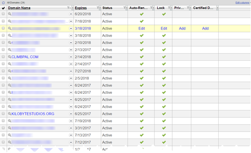
Actually, now that I think of it…maybe the world needs a service to quickly test landing page ideas…
Anyway, coming back to reality, ClimbPal is a service that is intended to dramatically-simplify the process of finding outdoor boulder problems to climb.
Yeah, I know what you’re thinking: what the hell is bouldering? Let me help…
Bouldering
(n.) Climbing on large boulders, either for practice or as a sport in its own right.
You’ve probably seen pictures of the sport before. If not, here’s a picture of someone bouldering in California:
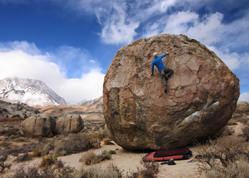
Isn’t that so cool!
I boulder on a regular basis, and over time I’ve found that it’s incredibly-difficult to find the boulders you’re supposed to climb without either an experienced partner or a cumbersome guidebook.
That brings us to this case study…
The Problem
The problem is simple, really:
Currently, finding things to climb on outside is incredibly-difficult without a personal guide or the use of outdated and ineffective tools.
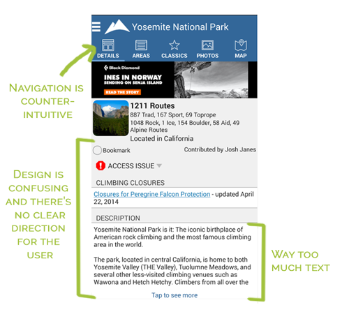
As usual, there are already some digital solutions to this problem (see below), but they’re plagued with usability issues. Not to belittle what they’re doing for the community, but it’s clear to me (and the climbing community), that a more modern solution is needed.
The Solution
This is where ClimbPal comes in. ClimbPal aims to dramatically simplify the process of finding outdoor boulder problems by leveraging two unique technologies:
- Offline navigation to help climbers find things to climb in the (often internet-less) woods.
- Computer vision to help climbers find where to put their hands and feet.
ClimbPal represents what I like to call the “Google Solution” to the problem.
The Google Solution
(n.) A solution so comprehensive and cutting edge that it dwarfs the competition simply by existing.
Anyway, you’re probably not too concerned with the details of the application itself – let’s see what I did to validate the idea (and how I could do something similar for you).
First, I developed a landing page…
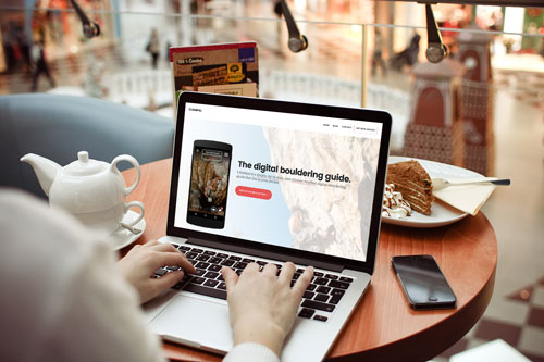
Pretty basic, I know – but it gets the job done. Notice a few things about this landing page that make it dramatically more effective than most, though:
- The call to action is incredibly clear. Your eyes just jump to it as soon as you hit the site.
- The experience is very visual. This helps to inspire positive emotions in the viewer.
- The form fields are minimal. This removes a ton of barriers to making the sale.
- The text is minimal, and simple. People don’t want to read your website – the text on my this landing page makes it very clear what the product does from the very start.
This makes it very likely that traffic will convert if they’re even somewhat interested.
The Results
So…what happened?
Well, after I launched the landing page, I made a simple post on Reddit to see if there was some mutual interest in the idea. Low and behold, I got quite a bit of positive feedback from the post!
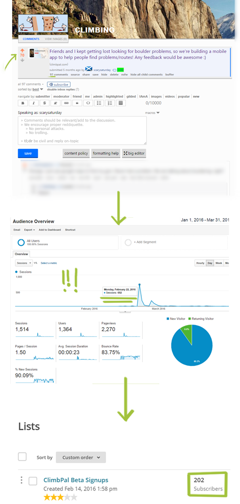
As you see, the post was quite popular, and traffic to my landing page spiked. As a result, I’ve now established a mailing list of about 200 evangelists that are more than eager to learn about the app when the first iteration is launched!
This is absolutely priceless when it comes to iterating on a new product. As I’ve mentioned elsewhere on this blog, marketing is everything, and this is a first step in the right direction.
Oh, and I setup a little feedback station in my local gym to see what my fellow climbers thought of the idea:
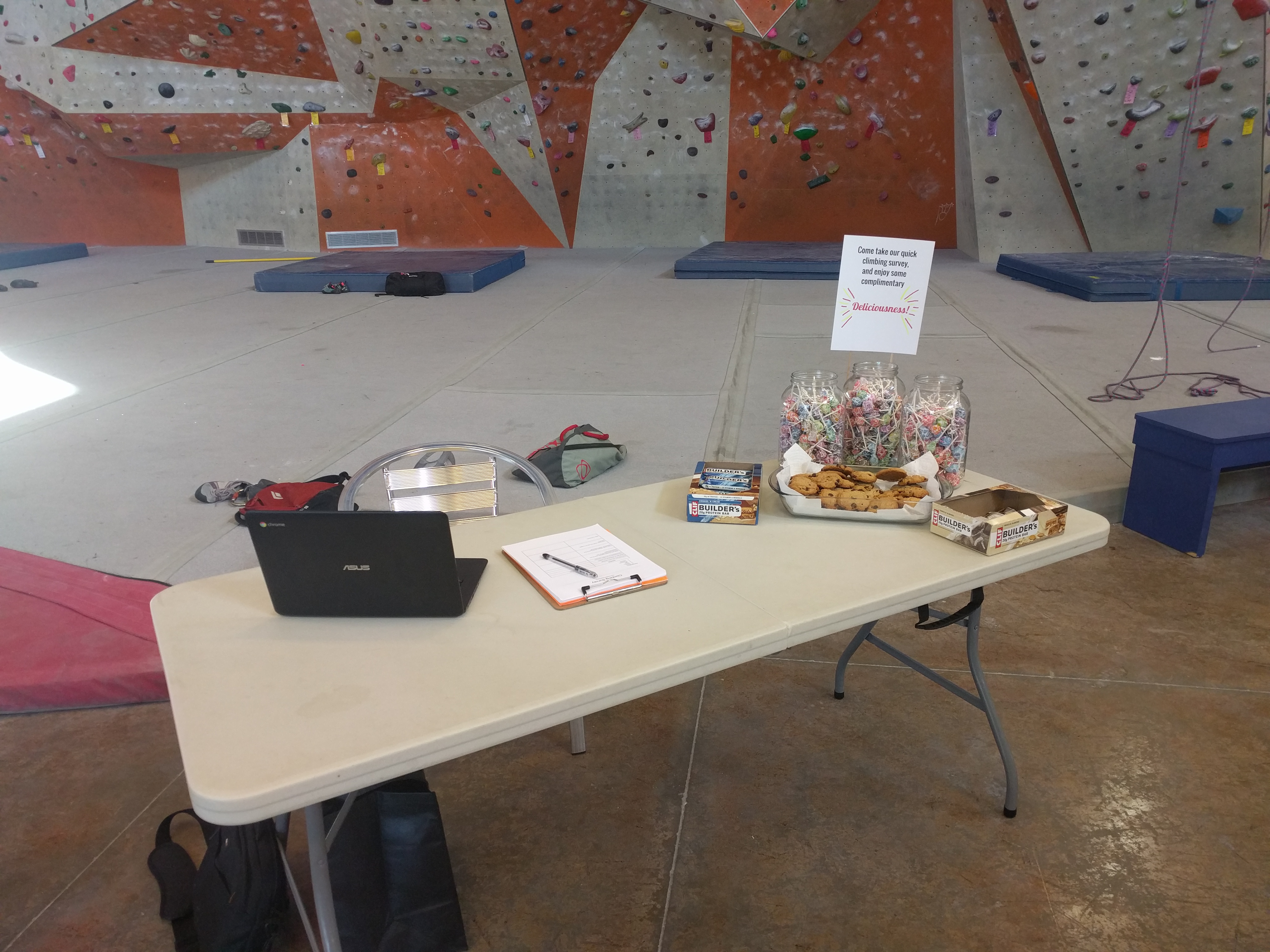
By the way, big shout out to Stone Summit Atlanta for letting me do this – this was a pretty awesome learning experience!
This is how you validate business ideas, folks. It took me one week to figure out if there’s real demand for a service like this, and now I can quickly iterate and market a solution to a problem without wondering if people even care.
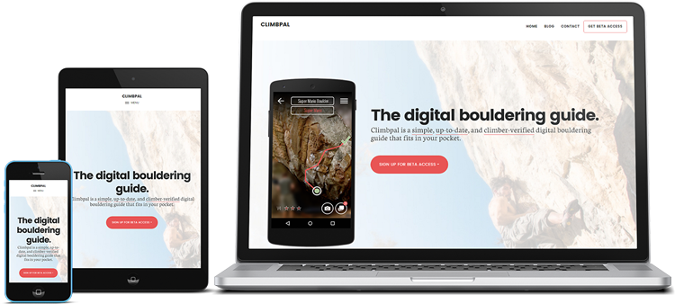
…now to start building this thing! 😀
Key Takeaways
While building out the ClimbPal landing page, I learned…
- Reddit is a wonderful place filled with very passionate individuals who will be more than happy to give you brutal feedback on your product/service.
- WordPress templates get a bad rap, but honestly they’re pretty good if you’re not planning on keeping a site up for a very long time.
- Biggest Lesson: It doesn’t take very long to validate a business idea – focus on taking action and getting measurable results!
