Mystic Stamp is the leading stamp dealer in the US.
As you’d expect, stamp collectors revisited their hobby when the 2020 lockdowns happened, and organic site traffic increased quite a bit.
In addition to their primary eCommerce store, Mystic runs a separate “discovery center”, where their customers can…
- Learn more about stamps and stamp collecting, and…
- Explore the rich history of stamps in the US.
They also have a daily email newsletter, named “This Day In History”, where customers receive a new email every day about that day in stamp history. Super cool!
But something wasn’t quite right…
The Problem
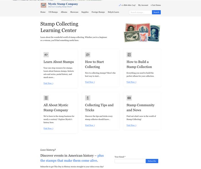
Here’s how the Mystic Stamp Discovery Center looked before I showed up on scene:
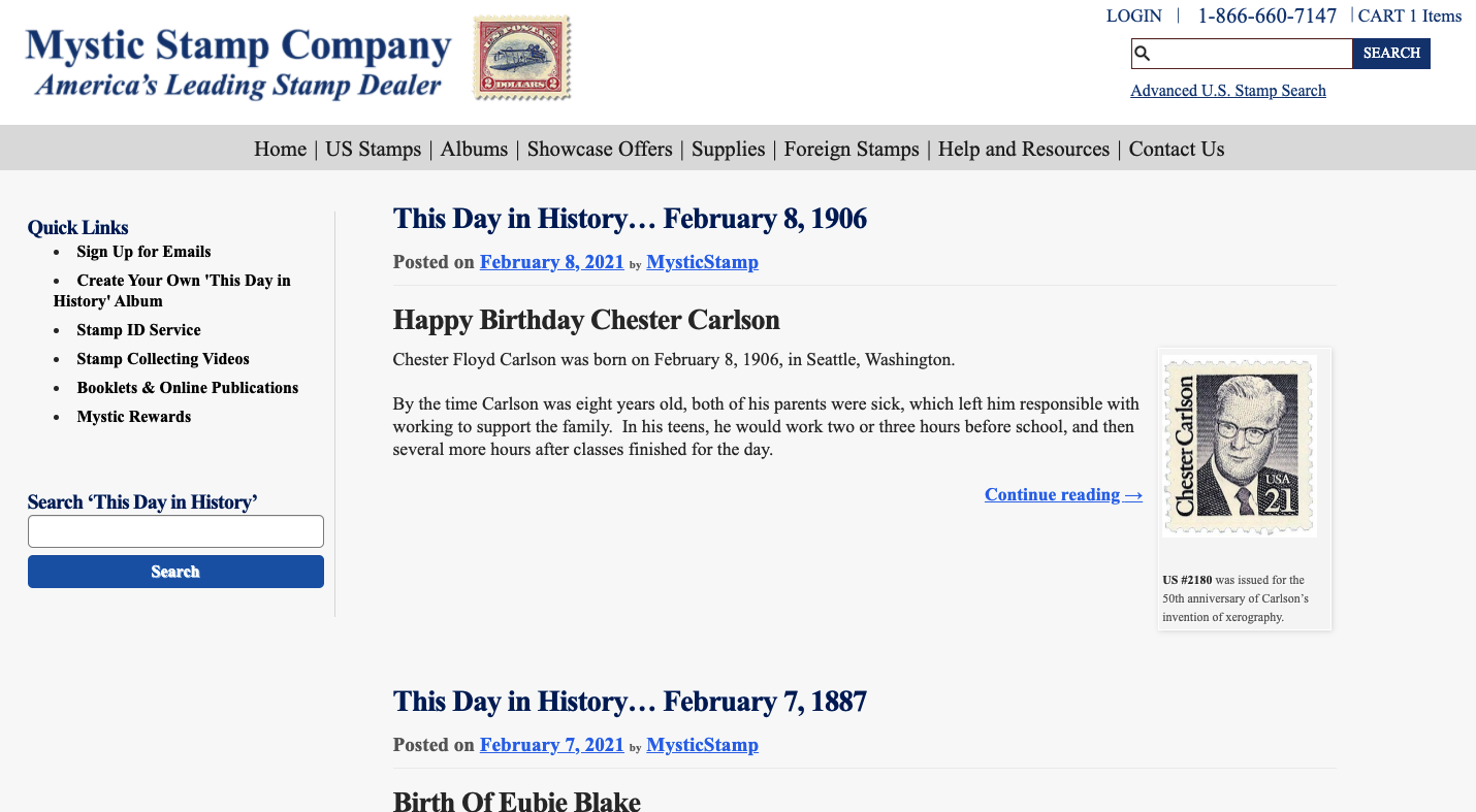
As you can see from this homepage, there’s was some room to improve the UX.
A note on Mystic’s customers…
Most stamp collectors started collecting quite a while back, when stamp collecting was in it’s hay-day. So, we had to take extra care to make sure that the site was suuuuper easy to use. That’s why we’re using Times New Roman, and that’s why the site feels a bit “basic”.
Specifically, there were 4 problems that we wanted to solve:
- Users were only reading one article per session.
- Users were rarely buying stamps featured in the daily articles.
- Users were having trouble finding relevant content.
- Users reported that the site generally felt dated, and the daily newsletter was a bit clunky.
So, we set off to solve them…
The Solution
Starting with discovery…
As always, we took a step back and tried to fully diagnose the problem before prescribing a solution.
We started by sending out a simple survey to get some quantitative, broad-strokes feedback from the customers that were already using the discovery center.
Then, we did about 20 interviews with respondents that opted in:

From that, we were able to get a preeettty close idea of what was lacking with the current site.
We then went on to address each problem individually by tackling the core issues we found:
- Users were having a hard time finding content that interested them.
- Users were unaware of other, related content.
- Users were regularly having difficulty accessing the daily “This Day In History” emails.
Making content easier to find…
First, we TOTALLY re-vamped the “This Day In History” experience to prioritize more exploration through the different articles on the site:
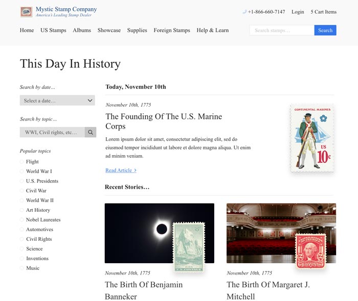
There’s a couple of key differences with this new experience:
- The search filters allow people to explore based on what THEY find interesting.
- Similar stories are made available from the default experience to make it suuuper easy to explore.
- The site is designed to be extremely user-friendly as to not throw off anyone off.
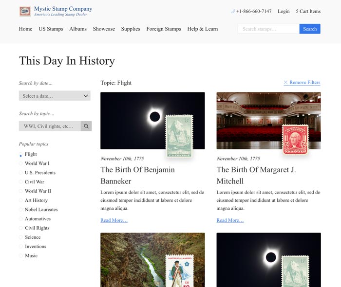
For example, here’s what it looks like when you click one of the “popular topics” on the left:
Making content easier to find…
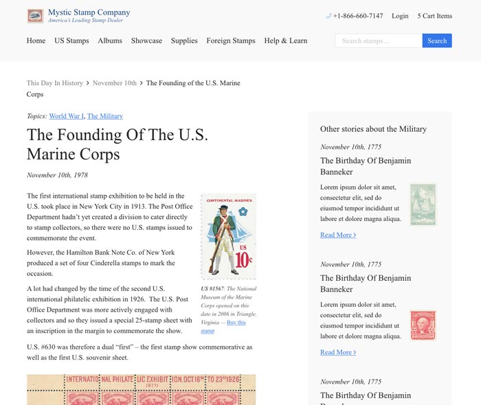
Since most of the site visitors came from their daily post notification emails, users would typically only read that article.
This makes sense, but why not promote other articles in the meantime to see if there’s any interest in those as well?
Here’s what we did:
Mystic Stamp also had a whooole bunch of super useful articles that help people to learn more about stamp collecting generally.
But…they didn’t get much traffic at all because they were so deeply hidden in their old site structure.
So, we pulled them out so people could find them, and organized them neatly according to a bunch of different topics:
Improving the UX of the daily emails…
We also got some feedback from users that their experience receiving daily content update emails was often erratic.
So, since the user experience encompasses EVERY interaction, we took a stab at cleaning that up, too.
We did a few things:
- Updated the newsletter plugin to a more modern version.
- Move their entire site to a better hosting environment to reduce the email send time.
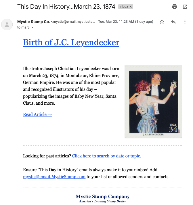
- Tidied up the daily email appearance a bit.
This made it so that there were fewer deliverability errors, customers received the emails at the same time each day, and were more likely to click through.
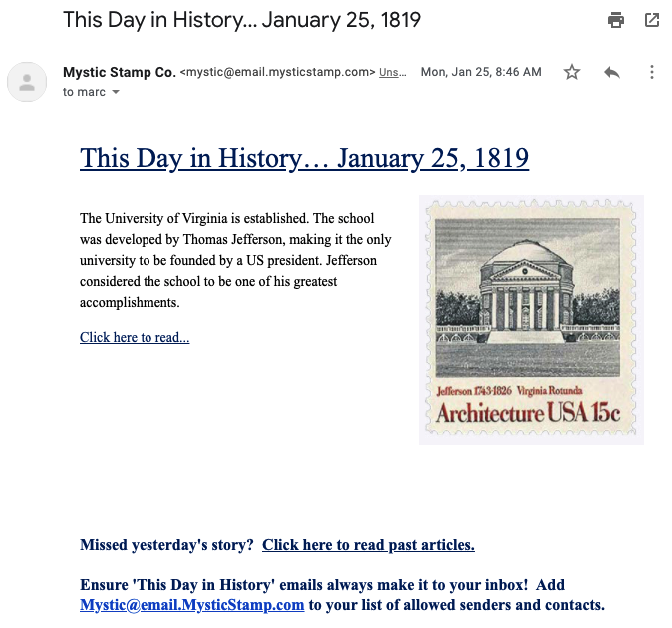
For context, here’s what the daily emails looked like before:
…And here’s what they look like now:
What about performance?
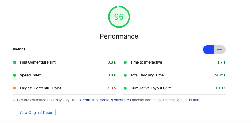
With any project that focuses on user experience, you simply HAVE to consider page load time as that affects everything about the experience.
Since we’d moved to a dedicated host and been really proactive about performance from the start, we knocked it out the park:
The Results
Remember, what we were trying to do here was to optimize the following flow:
- User sees a new “This Day In History” email.
- User visits the site to read that article.
- User EITHER buys the featured stamp for that article, or browses another article.
So that’s what we ended up tracking in the analytics tools, and that’s what we’ll be revisiting in a few months once the new site has had a chance to settle in. 👍
