Full Disclosure
I did not design the final result that you see on the right — I simply built out the information architecture and provided some wireframes from which this final result was built.
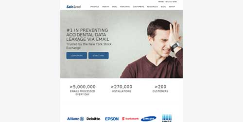
The owners at SafeSend approached me because they felt that the marketing site for their SaaS product was throwing people out the funnel a bit too early.
In a nutshell, SafeSend is an Outlook add-on that intercepts all email that is going outside the company intranet and asks the sender to confirm that the recipient really needs to see any sensitive attachments.
Their offering was quite simple, however their site was getting in the way of that message:
I was suspicious that there was a ton of opportunity to make their message resonate with their customers, so we dug right in.
The Problem
As always, when approaching these types of projects, you have to take a step back and try to understand what is really happening.
So, we started with a simple hypothesis:
The current marketing site for SafeSend is difficult to navigate, doesn’t inspire confidence in the brand, and doesn’t explain the value proposition for the solution clearly. This is ultimately causing fewer people to get in touch with the sales team than we would like.
We then set out to make a very honest assessment of the current site’s performance.
The Solution
After taking a few weeks to really dig into what needed to be done, we decided that there were a few high-impact opportunities on which we would focus (ordered by impact):
- The messaging is unclear: what problem does SafeSend solve for me?
- The information architecture is cumbersome: how do I find answers to my pre-sale questions?
- The site aesthetic doesn’t inspire confidence in a modern solution.
I then got to work doing my best to straighten-out each of these one by one.
A Quick Note
I always recommend that customer interviews sit right at the center of a discovery process like this, however for this project, the owners wanted to keep their customer’s identities masked.
Sometimes this happens, and you just have to use your gut to figure out where the “holes” are in the marketing site. That’s what we did here!
Cleaning up the Messaging
I always tell folks that already have internal design staff, that sometimes people outside the organization can have a clearer vision of the value proposition than those embedded in the company culture.
In this case, it only took about a week of internal interviews to really distill down all the jargon and uncover the core offering that SafeSend was presenting to the corporate world: peace of mind.
If you’re site is not converting as much as you’d like it to (and if you only have the bandwidth to do one thing), clarifying the header copy is one of the highest-impact activities.
When the solution you offer is clear to visitors, it allows them to self-select for your product, and it does wonders for trust building (i.e. “if you’re this good explaining what you do, I bet you’re good at that other thing, too”).
Here’s what we came up with for a first draft:
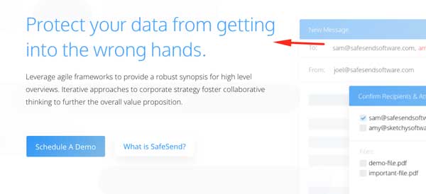
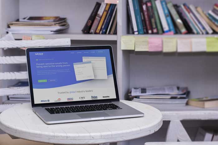
We also realized that this statement was a bit vague (something that we’d later address more explicitly), so we made sure to add a simple little visual demo of the product that instantly showcases the solution in practice:
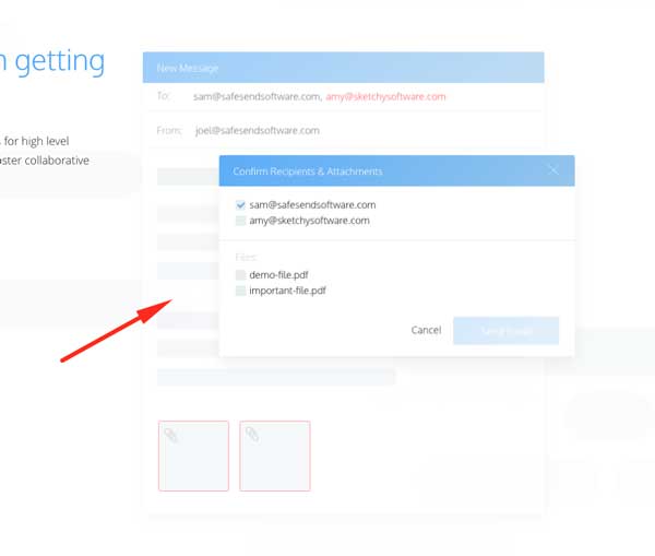
It’s important to note here that often you don’t need to use text to answer user’s questions about your product. Here, the question “…But what does SafeSend actually look like? What does it do?” is answered visually.
We continued to apply the same treatment to the rest of the site, dialing in the messaging using natural language, that speaks to the emotional pains behind the solution.
For brevity’s sake, I’ll spare you the rest of the details: you can see the final results of this on the current live site today.
Tidying up the Information Architecture
Sometimes, just the way that information is laid out on a site can make the message seem a bit more fuzzy than it needs to be.
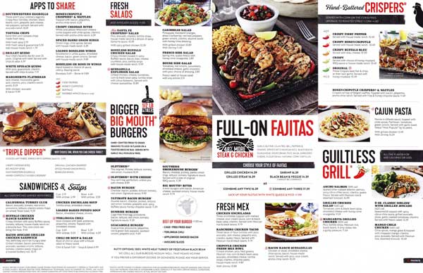
It’s like when you open up a menu at Chili’s, and and bombarded with hundreds of different options. The text itself is clear, but you still feel overwhelmed and confused — sometimes you just want a simpler set of options, presented clearly for you to choose.
The current site layout featured quite a few top-level navigation items, all with equal weight. This meant that if a user wanted to find a specific piece of information, they’d have to read the whole navigation bar first (quite like when you’re on the phone to your bank and they list all 9 options just so you can press 7).
As a rule of thumb, you only want to have a handful of top-level navigation items, categorized appropriately for each “search intent”.
Take a look at the navigation on the site that you’re using to view this case study for example. For someone that wants to learn more “about” my practice, they can use the dropdown “About”, and find specific tailored pages there.
This helps me to maximize the valuable screen real-estate, while also making sure that site visitor’s questions don’t go unanswered.
As a rule of thumb, you only want to have a handful of top-level navigation items, categorized appropriately for each “search intent”.
Anyway, given that SafeSend had quite a bit of technical documentation on their site, we had to do our due diligence to accomplish the following:
- Answers to user’s questions needed to be easily accessible on the site somewhere, and
- We didn’t want to overwhelm the users with information in an attempt to give them it all at once.
This is what we came up with for the final site architecture:
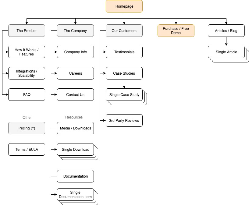
Since there were quite a bit of nested data (ranging from videos to articles to PDF downloads), we wanted to build a really user-friendly menu that enabled ease of access.
To do this, we implemented a common strategy that great designers often employ: we just copied the UX from an industry leader — hah!
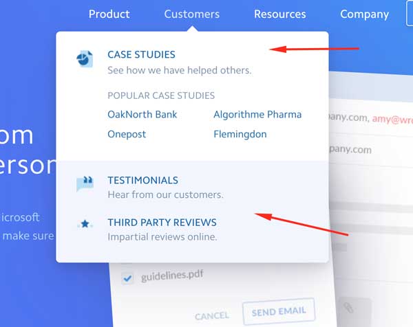
The Stripe.com site navigation is world-class in usability and simplicity, so we implemented our own version for SafeSend:
Modernizing the Site Aesthetic
Finally, on top of all the quick wins we’d implemented for the brand, we wanted to polish it up to represent a modern, capable software company.
Although this usually involves quite a bit more effort than the previous two tasks, a site’s aesthetic has a profound impact on a user’s perceived experience.
The site aesthetic can really play with the emotional feel of a site, and this can often work against you, or with you. A modern, clean, performant site often helps customers breathe a sigh of relief — they know they’re placing their trust in the hands of capable, weathered professionals.
Alternatively, a clunky, dated feel often does the opposite.
It’s wise not to jump to conclusions (sometimes, blatantly violating UX principles works, see lingscars.com for example), but when you don’t have much customer data to work with, I’ve found that it’s a safer bet to err on a conservative, modern design.
Ultimately, I was only responsible for kicking off the project with discovery: I helped SafeSend build the foundation for this project, and the final design that you see today was built by another firm.
The Results
In the end, now that SafeSend has been setup with a new, performant web presence, it would be hard to make a case for the old site. Absolutely everything about the new experience has been built with incredibly attention to detail, with an intense focus on clarity.
It’s sites like this that do convert really well.
It’s projects like these that make me really enjoy what I do: we took a site that was struggling to get a message across and polished it up into something truly remarkable that resonates with customers.
I truly enjoyed my time spent with the SafeSend team, and I firmly believe that we built something immensely valuable together.
