Sometimes, you don’t need a massive site overhaul to land more trials for your SaaS product.
It could be as simple as tweaking the copy so that your solution is more clear to customers.
That was the case for Johann over at Wink Reports.
The Problem
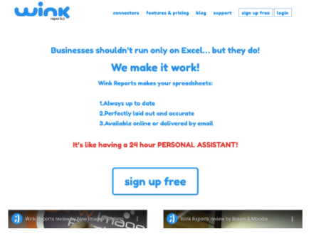
The folks at WR approached me a few months ago, because their landing page was getting a bunch of traffic, but very few signups.
Strange, eh?

You see, Wink Reports had a really clever marketing strategy.
At their core, they’re a reporting tool that helps you make sense of your data.
So—naturally—they went to where their customers already are and partnered with other CRMs and data-aggregation tools that didn’t have reporting capabilities.
These partners would send their customers to Wink Reports when they needed reporting so that their customer wouldn’t leave and go to another platform instead. Brilliant!
On using channel partnerships
This is such an underrated marketing strategy. Instead of trying to build your own customer base, just help a larger company enhance their offerings with one of your own.
Because of this, their primary landing page was getting a ton of highly-targeted, qualified traffic.
…But very few signups. Why?
I started investigating.
Digging deeper…
First, I got on the phone to talk with their customers.
I wanted to learn more about why they ended up using Wink Reports (when there’s already a bunch of reporting tools out there).
There was a consistent theme to the feedback:
- They were initially drawn to Wink Reports (WR) because of their seamless integration with the other tools they were already using.
- The idea that WR would help them build out highly-custom reports was a life-saver.
You see, the types of people that use the software with which WR integrates have access to very complicated databases.
It’s often a huuuugge pain for them to make sense of that data in any meaningful way.
That’s where WR came in.
Johann and his team would regularly create highly-customized reports for his customers that they simply could not get elsewhere.
I’d found the unique value proposition, now we just had to translate that into a simple sound-byte for customers to consume.
The Solution
At this point, I had a pretty clear understanding of what needed to be done, it was just a matter of doing it effectively.
Tightening up the header messaging
The first thing people consume when they hit your site is the homepage header.
It’s critical that this header does two things:
- Explains what you do for me, and
- Explains what makes you different (or unique).
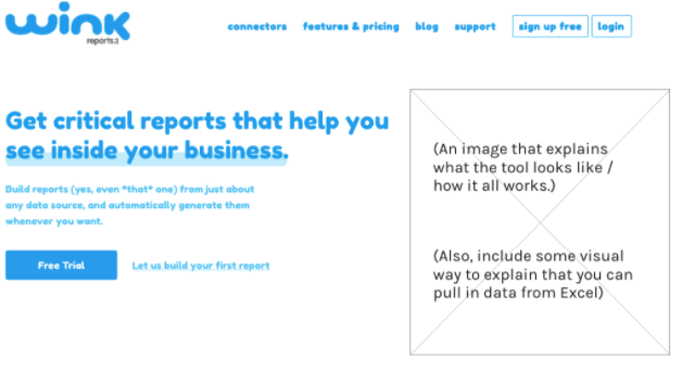
So, I suggested that they tweak the copy to something like this:

This new messaging accomplishes a few different things:
- It talks directly about the value users get from the software (insights into their business data).
- It clarifies that WR can create just about any report.
- It introduces users to the idea that their team will help them to create their first report.
This badboy is doing some heavy lifting!
…but more importantly, anyone that lands on this page will have a much clearer understanding of what WR can do for them (and that makes them so much more likely to buy).
Polishing up the site aesthetic
I also left their team with a whole host of reccomendations on how to modernize the site aesthetic.
Not so much because the aesthetic was bad per se, but rather because nowadays buyers in the SaaS space have a much higher bar when it comes to design expectations.
If buyers feel that the site aesthetic is dated, they lose a bit of trust in the brand.
The Results
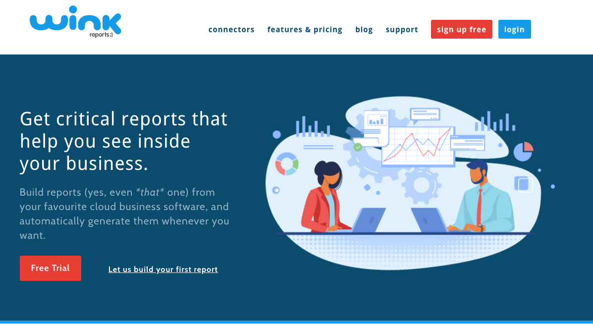
After a bunch of effort from the WR team and their designer, here’s what they came up with:

This is muuuuch clearer (and feels a bit more modern).
But…did it actually do anything? Are they getting more trials now?
I reached back out to the team last week and got some anecdotal feedback that “it feels like a lot more trial signups are happening”. Of course, I’ll be checking back again in a few months to get some hard data for you.
I thoroughly enjoyed working with Johann and his team — they’re going to do some awesome stuff for the reporting community in the new few years!
Here’s what Johann had to say about our time together:
"Marc was fantastic to work with. He has a real knowledge of the B2B psyche and was able to really drill down into our messaging issues. He conducted interviews with staff and clients and really took the time to understand what our business was all about. [...]"

Johann Du Toit
Wink ReportsKey Takeaways
I always find myself learning more with each project.
Here’s what I’m taking away from my time with WR:
- Customer service can be marketing when done exceptionally (Johann’s onboarding was super personalized and got a ton of praise from customers).
- Even products that seem as simple as “a reporting tool” have something about them that helps them stand out from the pack.
- Biggest takeaway: Customer interviews are absolutely essential.
Thank you for taking the time to read this — I hope you found it useful. 🙂
