Want the full experience?
This blog post is an excerpt from my webinar last week called “Building a SaaS homepage that lands more demos”. You can check that out if you want to see everything come together in real time.
It’s really easy to let flashy language and esoteric acronyms get in the way of your messaging in the SaaS space.
Often, you can easily scare people away by simply not answering basic questions they have. Questions like:
- What problem do you solve?
- Who do you solve that problem for?
- What will you do for me?
This usually crops up on the homepage header (you know, the big text “above the fold” on your homepage/landing page), and it’s a damn shame because that’s prime real-estate for you to explain your offering.
You have the full attention of the person visiting your site at that point, so you have to get it right.
Today, I’m going to go through a quick example of what it takes to make that homepage header really do some heavy lifting (spoiler: it’s not that hard!).
Let’s take a look at Reelevant, a SaaS product that helps people re-market products to existing customers.
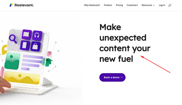
Here’s their current homepage header:

I actually quite like the feel of this design (it’s delightful!), though it’s also tragically-confusing…
- What does unexpected content mean? The only unexpected content I get is spam emails from India.
- How will it be my fuel?
- What will I be demoing?
It took me about 8 minutes of browsing during my webinar to eventually uncover their unique value proposition.
It seems like they do a few things:
- They send out unique offers to people that are actively receiving emails from you.
- Those offers are tailored to their individual browsing habits (i.e. if you’re looking for bikes, you’ll get bike offers).
- They connect with whatever email marketing software you’re already using.
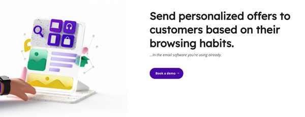
Mixing this all together, here’s what I came up with:

See how this very explicitly outlines the problem that is solved for the customer?
There’s very little ambiguity about the service now, and it makes me a bit more intrigued about that demo. 😉
If someone like me had to spend ~6 minutes to find out what you do, you can bet busy customers aren’t going to bother.
Now it’s your turn!
I’ve put together a “homepage header” workbook that you can download if you want to tighten up the messaging on your landing page.
Clear and simple messaging has a real, tangible impact on the bottom line, so take some time to really iron out what you want to say, and then step back and watch those conversions roll on in.