If you’re a regular reader of my blog (or my sexy newsletter), then you’ll know that I’m a stickler for clear, simple messaging.
This is because I see messaging as an enormous opportunity for SaaS company owners to win, and they almost never get it right!
Check out this showcase of beautiful SaaS landing pages that was posted to Reddit yesterday:

Although most of these examples are stunning visually, a few of them miss the mark on just explaining what problem they solve for customers.
I’d argue that this is much more important than soliciting trust from the user with a clean, modern design aesthetic.
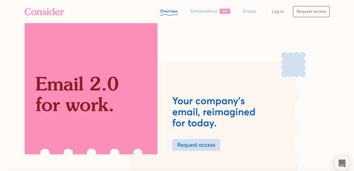
Here’s one of the sites from the list that is aesthetically beautiful, but drops the ball on messaging:

Digging a little deeper, it seems like Consider is some sort of conversation-management tool that integrates with your email client to keep track of ideas, updates, and conversations so they don’t get buried….I think?
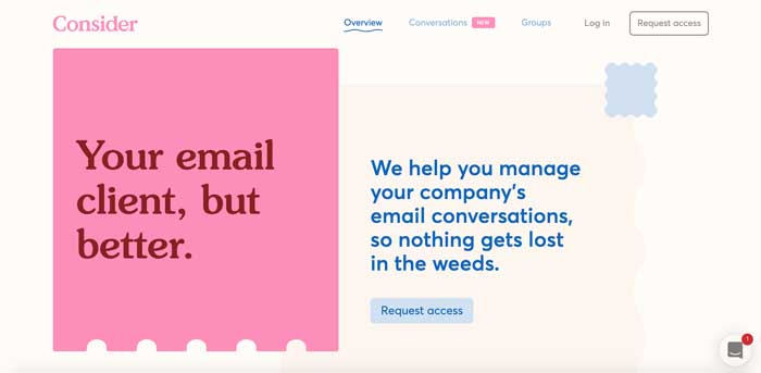
Assuming that’s what they do, here’s some title text that really clarifies the problem they solve for people:

Okay, great, the titles are simpler now…but who cares?
Here’s why this matters: if you don’t explain the problem you solve for me quickly, it’s hard for me to justify staying around.
Of course, not everyone that hits your primary landing page is going to convert — that’s a fantasy. However, there are people who would have probably converted if there wasn’t as much friction between them and your service.
Here’s how I see it:
An unclear value proposition is a huge piece of friction: it’s like a dirty piece of glass that obscures everything else about the site experience.
This is such a common problem in the SaaS space, and I’m personally on a mission to save people from unclear messaging.
I’m a big believer that your marketing funnel needs to start with clarity (and hopefully keep it all the way to the end).
Although in an ideal world, you’d spend a few days talking with customers first, I’m certain that most business owners can come up with a clearer value proposition in just a few minutes of honest reflection.
Want to do this yourself?
I’ve put together a “homepage header” workbook that you can download if you want to tighten up the messaging on your landing page.